Placing UX at the forefront of WeVideo
CONTEXT
Lack of UX strategy and rapid growth resulted in an unpolished experience.
I led the design evolution of WeVideo, defining vision, research, and influencing change throughout my eight-year tenure.
OUTCOME
12% increase in satisfaction
7% increase in usability
600 MAUs Impacted
ROLE
Design Lead

Background
WeVideo, founded in 2014 is a video creation platform which catered to a wide audience including schools, SMBs and consumers. At its early stages it was mostly engineering driven focusing on CRUD workflows with a limited UX strategy.
When I took over this five-year-old product, I started with an audit to assess its state and identify opportunities. My goal was to develop a strategy for gradually improving the experience and integrating UX practices.
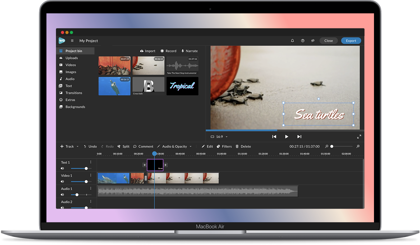
An interface showing its age
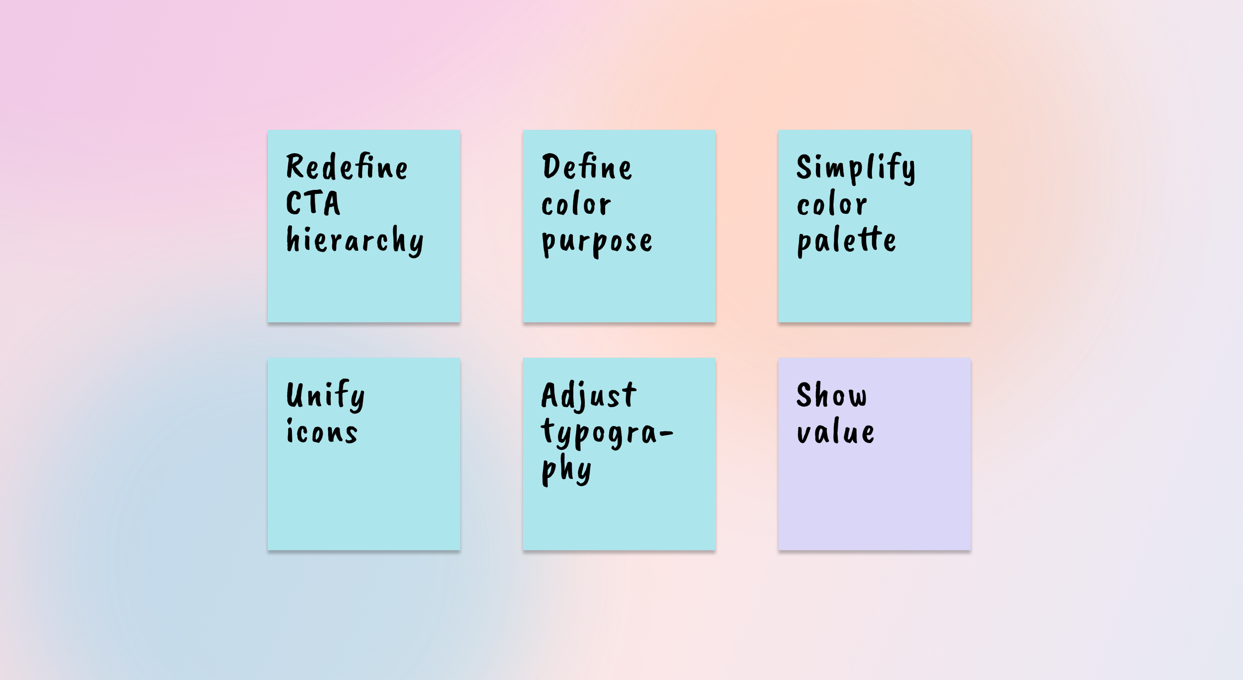
A comprehensive audit revealed several visual and interaction issues, including mismatched icons, inconsistent typography, unclear color schemes, and confusing foundational elements.
How might we elevate the editor UX gradually?
Strategy
I broke down the project into three stages so we could gain momentum quickly through low-hanging fruit changes while we established a more sustainable processes.
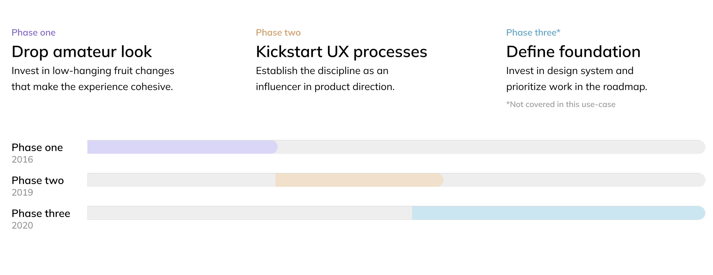
Drop amateur look
To make an impact quickly with a low-touch solution I decided to focus on basic primitives that could be edited through simple CSS changes.
These changes subtly refreshed the interface making it look professional without causing friction to users.
This also helped me communicate the vision and impact to gain buy-in for larger initiatives down the road.
BEFORE

AFTER
Kickstart UX process
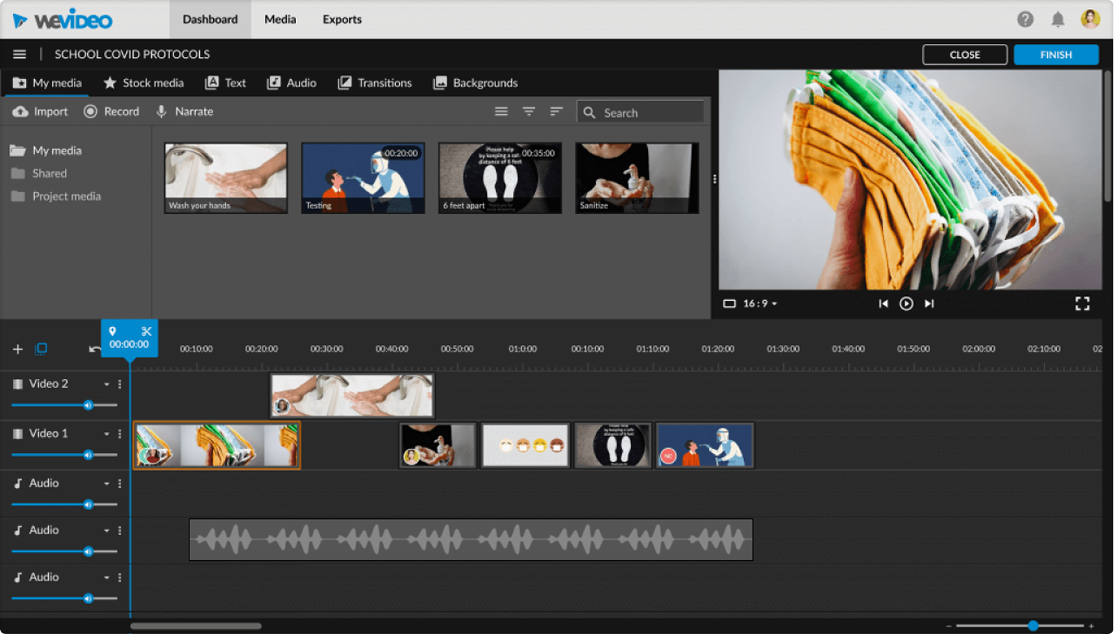
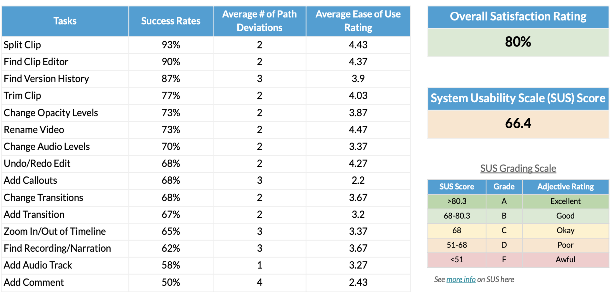
By phase two we had more bandwidth and resources. I hired a UX researcher to conduct a benchmark study to identify the main pain-points in the most common editor interactions.
During this phase we focused on improving usability and simplifying interactions which we validated through rapid tests.
Our research revealed that transitions were a friction point, as users expected them as effects between clips rather than items that needed to be dragged onto a clip. I redesigned them to appear as in-context hints when a clip was selected. This improved discoverability and usability.
BEFORE
AFTER
The success rate for this task improved by ~20%.
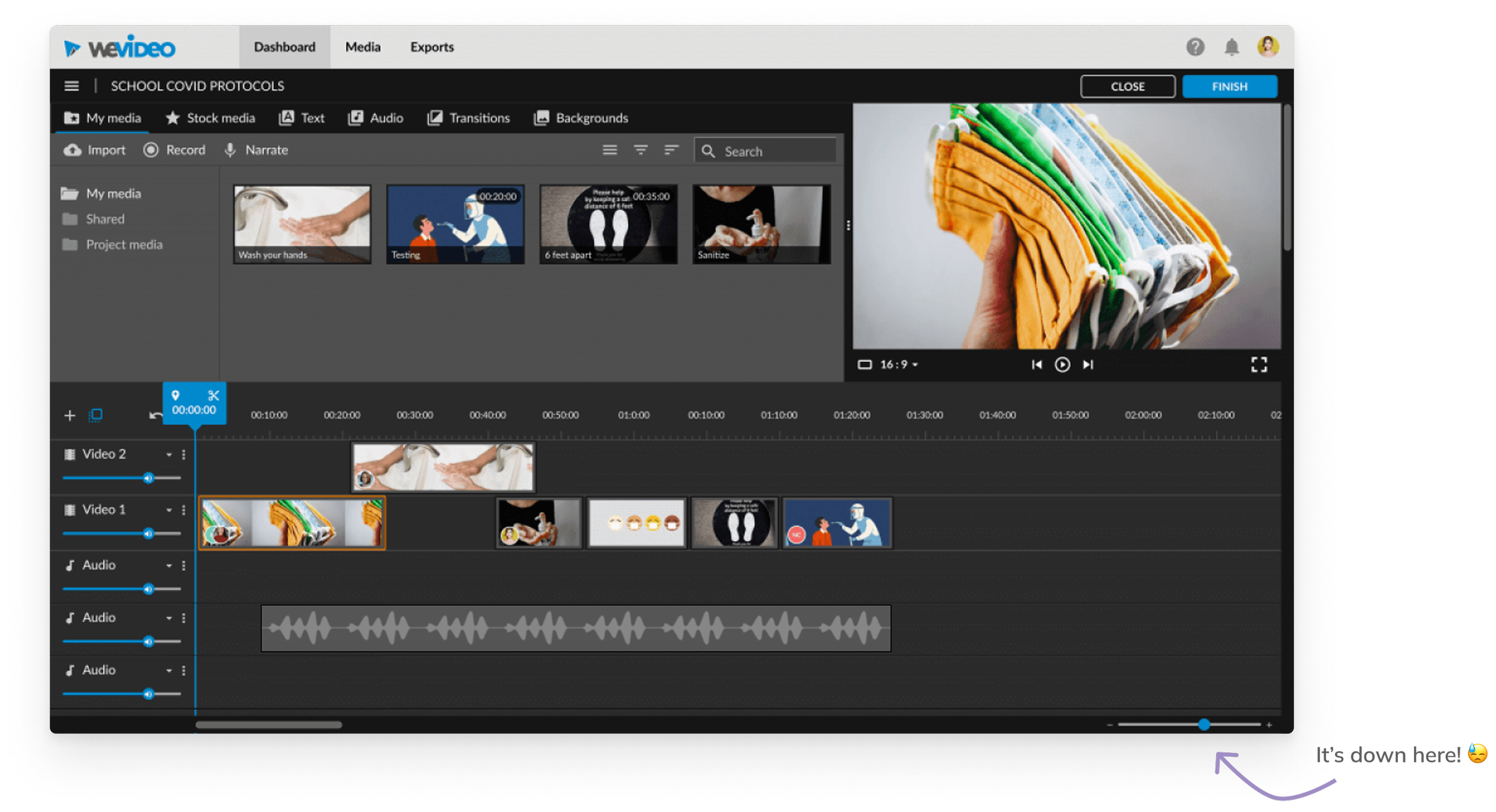
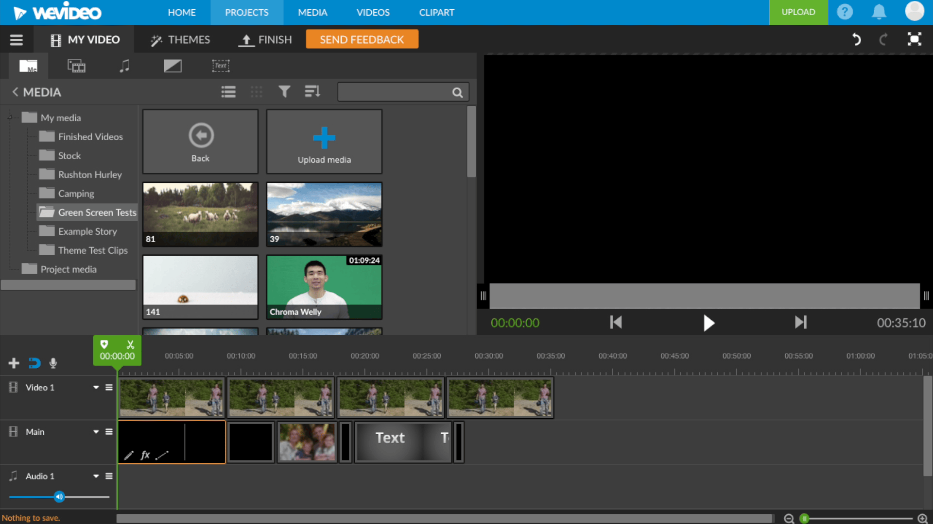
Our research also revealed that users were struggling to find timeline actions like undo/redo and the zoom slider. These actions were spread across the interface and at times buried in the UI and were lacking clear labels and affordances. Can you spot the zoom?
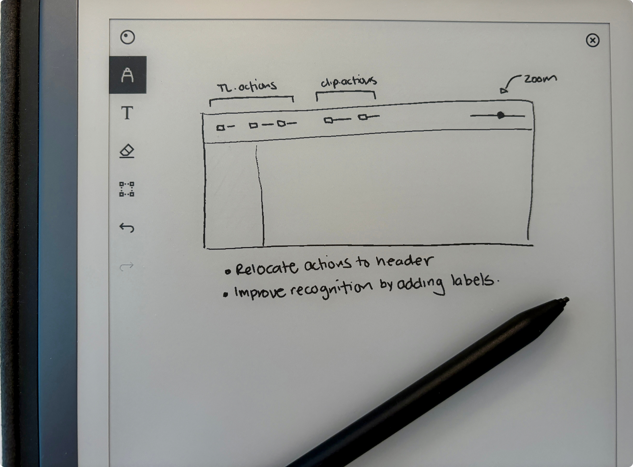
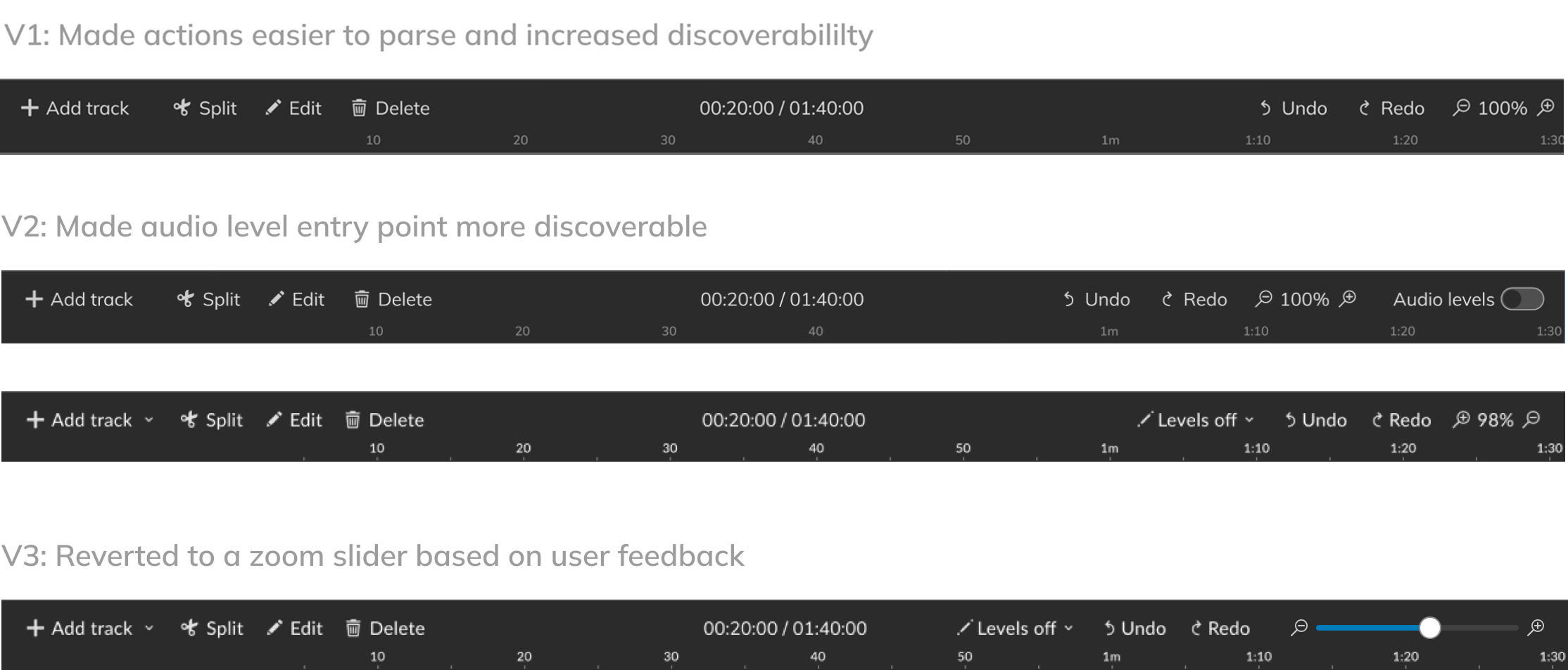
Revisiting the Information Architecture
After identifying the common actions that affected the timeline, we decided to relocate them to a centralized header where we could introduce labels and improve the recognition of these actions.
We experimented on the order and tested it with our users until we landed on the final version.
BEFORE

AFTER
Learnings and results
I learned gradual change can make a big impact, but it can also disrupt users if the value is not clear. Steady incremental change also helped us change the culture and gain credibility.
These are the results of the second phase:
